Green Energy
Demonstration Site
綠能科技示範場域
2020・Wayfinding
location
tainan, taiwan
realization
Dec. 2020
client
Industrial Technology Research Institute
architecture
Bio-architecture Formosana
design team
Szu-an Yu
Chuan-wei Ting
photographs
Studio Millspace
Path & Landforms
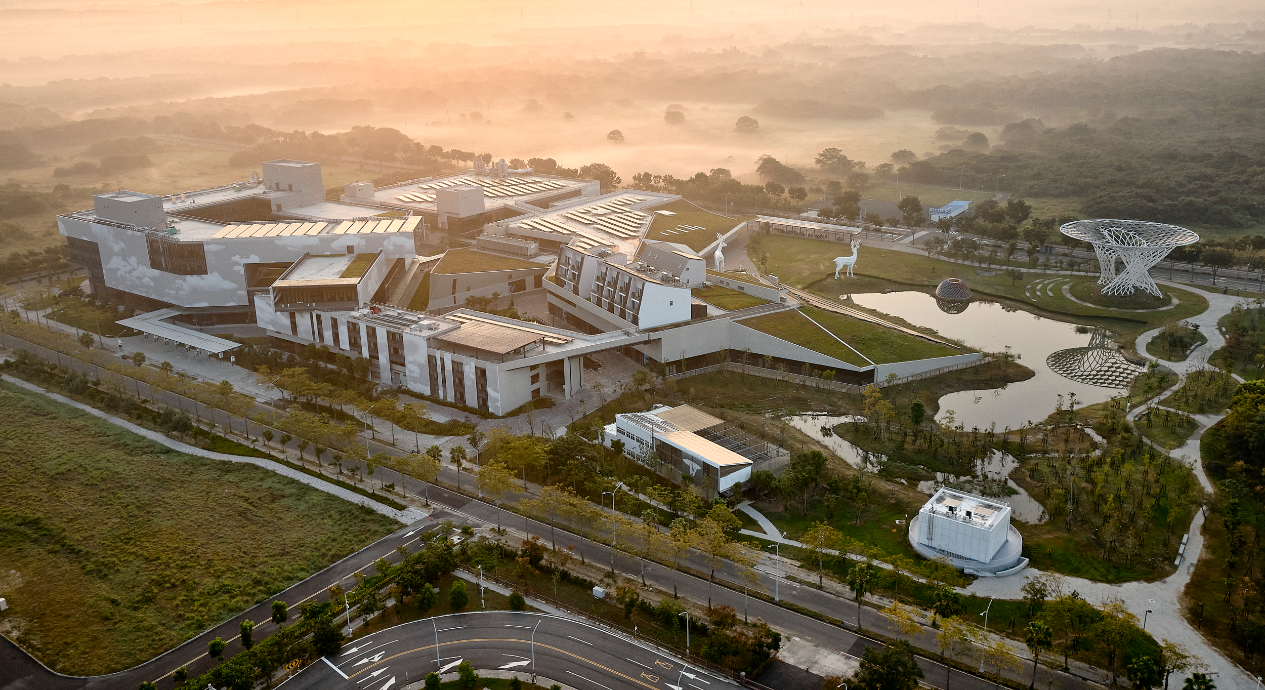
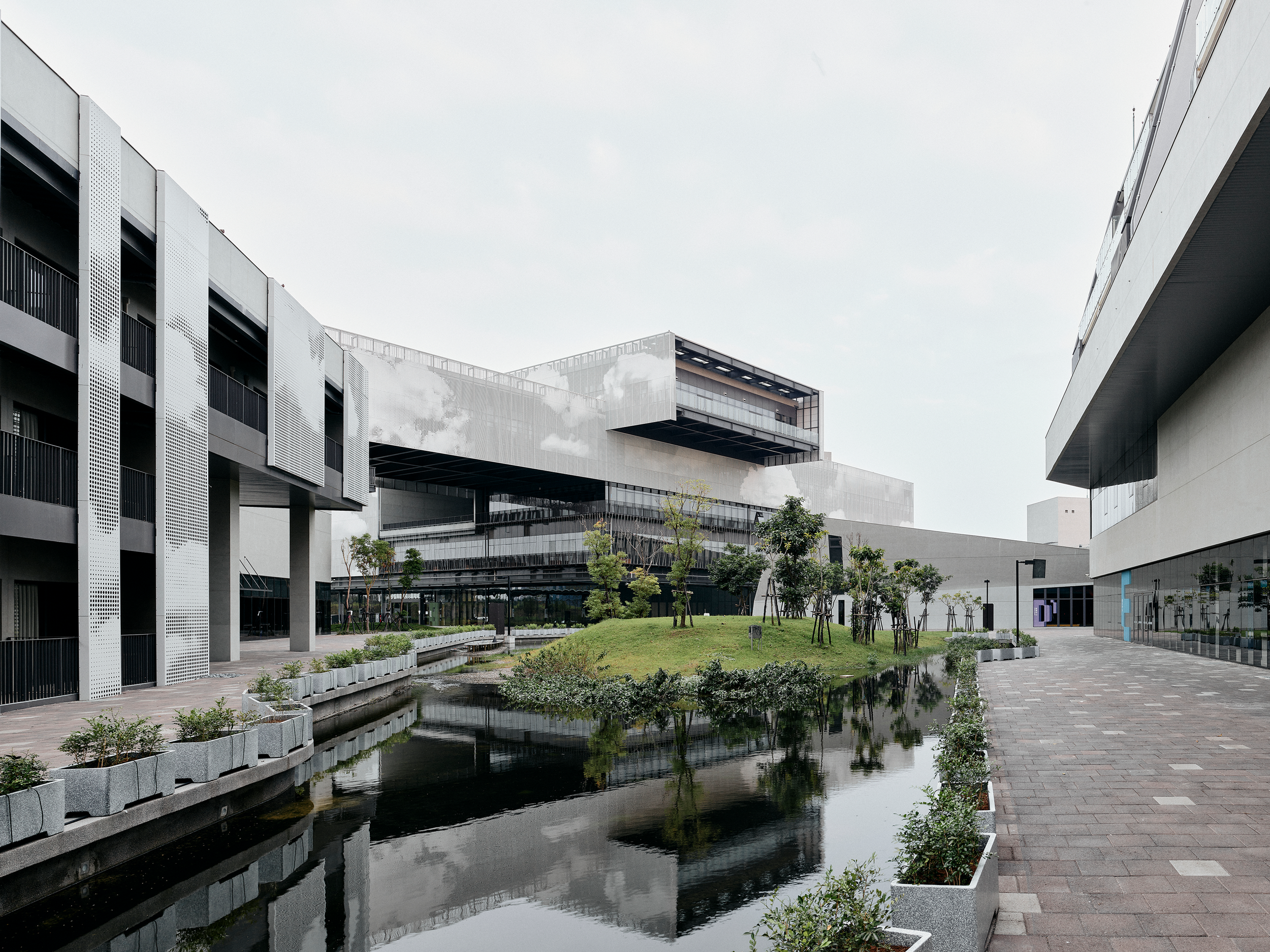
位於台南高鐵特定區之沙崙智慧綠能科學城D區,綠能科技示範場域擔任著開發及綠色生活應用示範的角色,並提供技術研發、產業測試及產業媒合資源。園區佔地廣大,共有五棟主建築物座落於此場域中,我們嘗試透過環境視覺設計,在賦予不同區域識別性的同時,也能軟化工業技術開發常有的嚴肅印象。
The Green Energy Demonstration Site, located in the zone D of Shalun Smart Green Energy Science City in the Taiwan High-Speed Rail Tainan Station, demonstrates sustainable development and application as well as provides resources for technology developing, testing, and matching between industry and research. The demonstration site includes five main buildings with unique identities for each. Through the environmental visual design, not only the diversity was introduced but also demystified the mechanical stereotypes associated with engineering environment.


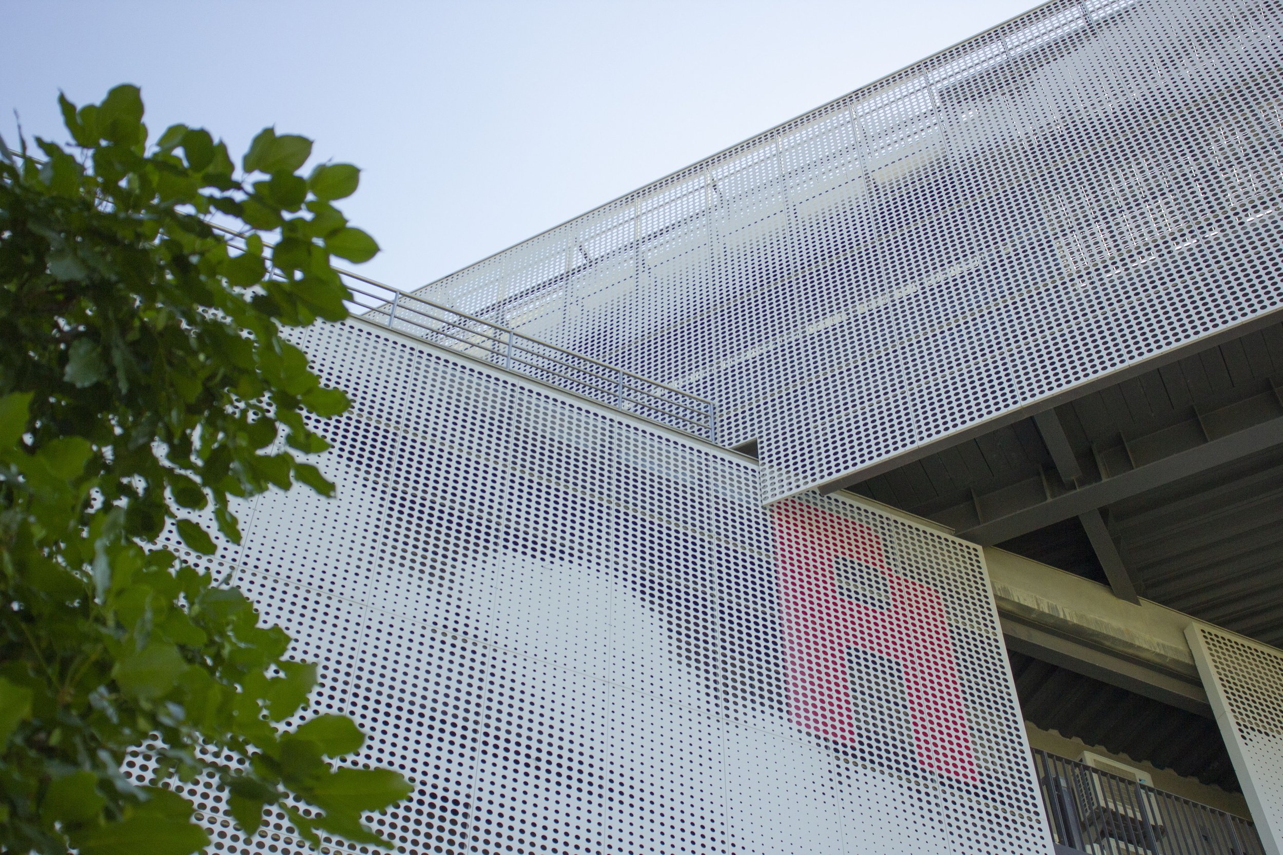
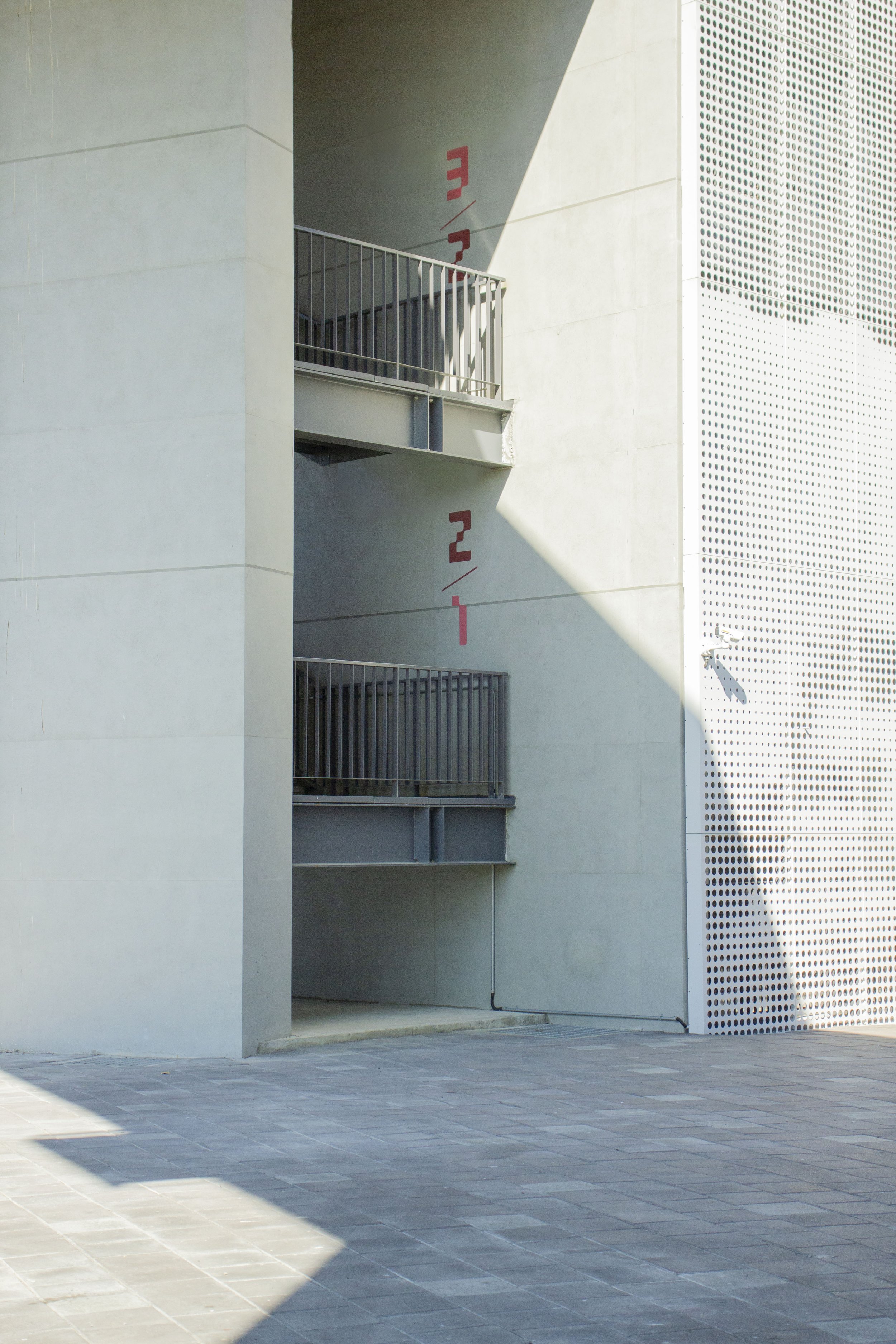
建築物的鮮明編號
每棟建築物擁有專屬的鮮明色系,從主要核心廣場即可看見各棟編號、大型圖樣及代表色;而進到建築物內,與室內牆面、梯廳,甚至家具的色彩計畫搭配,共同塑造出一致且清晰的空間特性。
建築師在建築立面設計之雲形圖騰,提供了環境視覺設計與建築物完美銜接的機會;利用沖孔金屬板的視覺穿透性,將建築物的編號字母設計在其與帷幕之間,而使字母標示和諧地融合進建築外觀中。
Distinct building numbering
Each building belongs to its own distinctive color palette. Individuals can spot the building numbers, visual patterns, and representative colors from the central core plaza. The buildings' interior, walls, signages, and even furniture all match the color schemes and work together to create a consistent spatial identity.
The cloud-shaped totems on façade designed by the architects, opened up a perfect chance for bridging the environmental visual design and a physical building. The perforated metal panels’ visual permeability allows us to place the buildings’ numbered letters in between the panels, fully integrating them into the building’s exterior.


網格系統的像素數字
視覺元素的設計細節發想,來自於太陽能板常見的網格系統,不僅字母與數字以像素化的方式呈現,指標面板之色彩、圖文資訊分割,也期待提供觀者一些視覺聯想的線索。
In terms of its visual element, the design details are derived from the solar panels’ grid system. Not only the letters and numbers are presented in a pixelated style, but the colors and layouts of the signs are also played with the grid system. Thus, the signs not only serve the role of an infographic but also provide creative visual associations and spark interest in its viewers.


室內標示系統


停車場標示系統


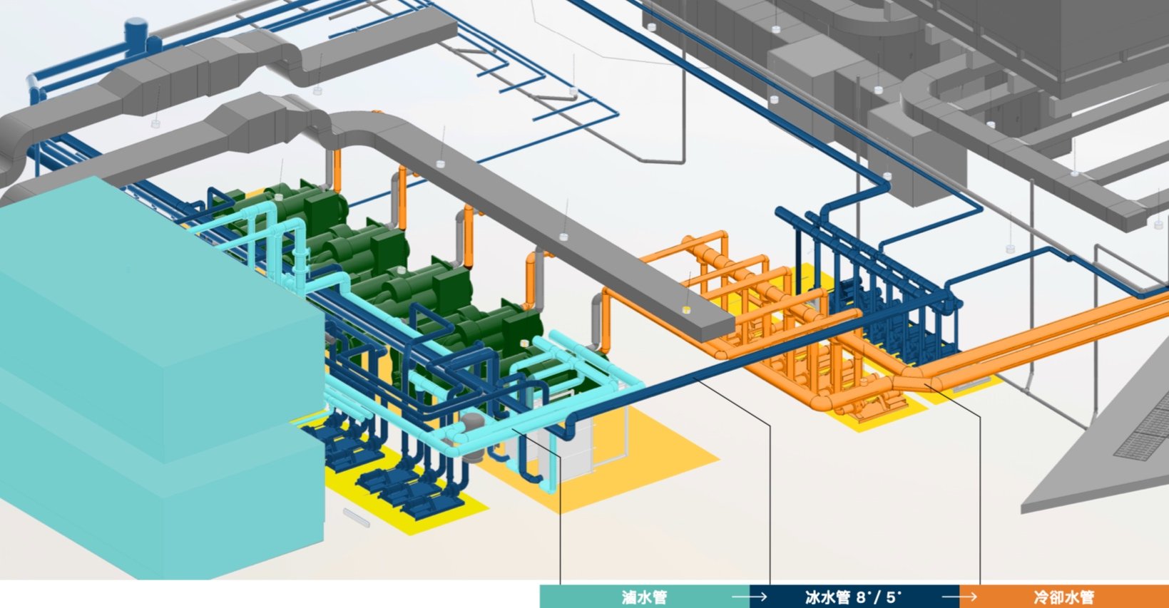
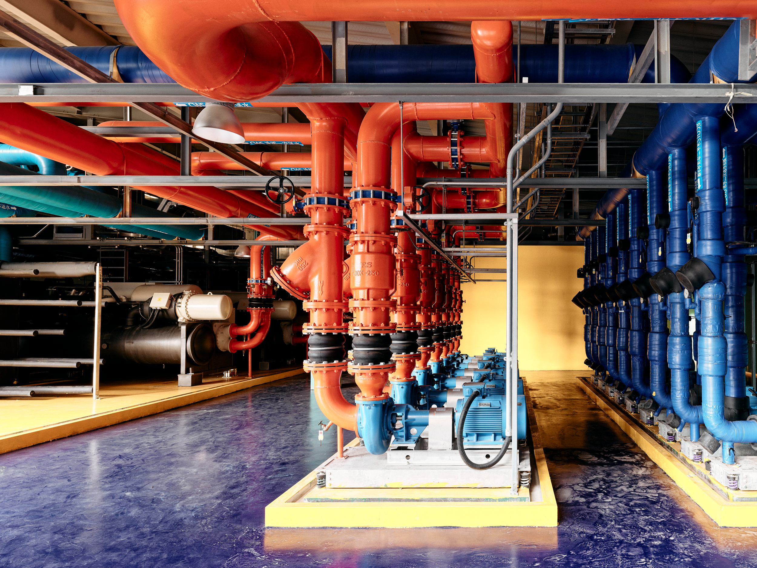
能源中心色彩計畫
除了全區各建築物的色彩計畫外,本案也針對D棟製程試驗場內之能源中心展示機房設計專屬的色彩計畫,將機房內部之管線設備與空間進行色彩區分,並透過色彩呈現管線內運作功能。
In addition to the color scheme for each building in the entire area, this project also has a dedicated color scheme for the energy center display machine room in the D building's process test field. The interior pipelines and space of the machine room are color-coded, and the color is used to display the operating functions of the pipelines.