
Tainan Public Library
臺南市立圖書館
2021・Wayfinding
location
tainan, taiwan
size
37,000 sqm
realization
Jan. 2021
client
cultural affairs bureau,
tainan city government, taiwan
architecture
mecanoo
MAYU architects
design principal
Szu-an Yu
design team
Chuan-wei Ting
Vincent Yuan
Jian-yu Wang
collaborator
25degreestudio
brand identity
手心設計事務所
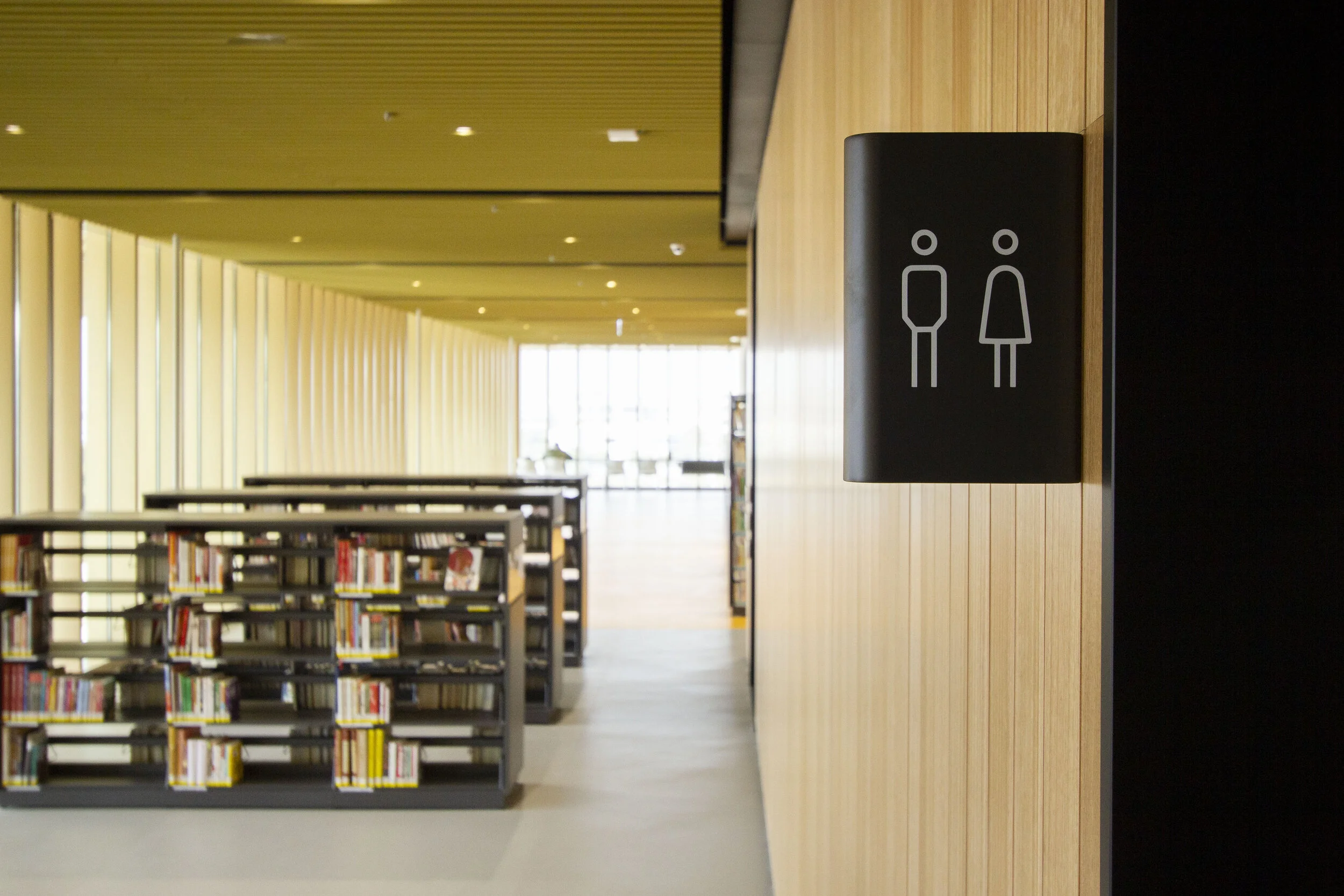
臺南市立圖書館的指標系統,利用幾種形式的立體圓筒狀或圓角,低調地呼應此建築個性—優雅的圓柱及中央挑空形式;並以一致的灰黑色為基調,隨空間屬性的不同做適度變化。
The wayfinding system of Tainan Public Library adopted transformed cylindrical shapes or rounded corners to uniformly and subtly echo the key features of this architecture: the atrium and the elegant columns. The dark grey was selected as the primary color and collaborated with other lively colors and elements to create a diverse atmosphere.
建築與色彩的對話
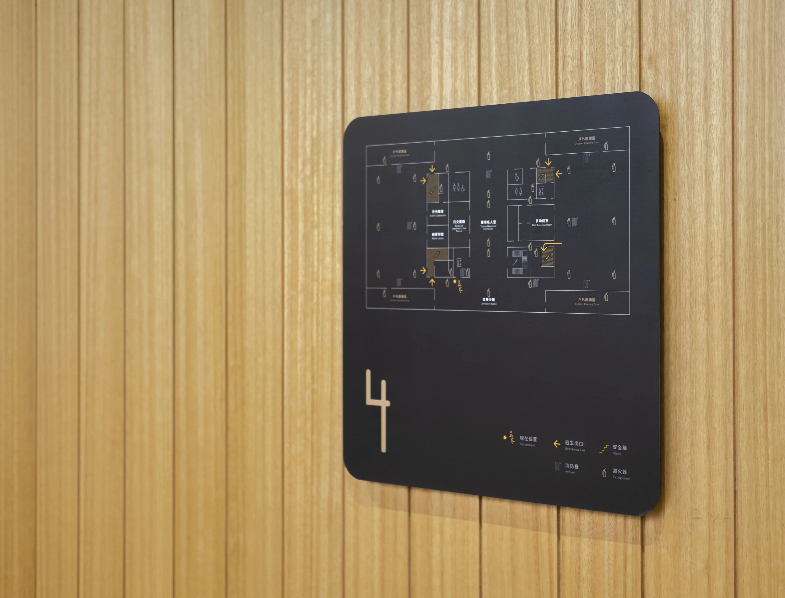
圖書館的指標系統,擔負著傳遞龐雜資訊的任務,該如何簡潔俐落地與建築相互協調,一直是設計時最大的挑戰;此案最後取了空間中大量的灰黑色為基調,白色與金色為點綴,並配合圖書館既有識別系統的色彩計畫、客製數字、圖騰於其中。
The wayfinding system of the library is burdened with the task of conveying a vast amount of information. Finding ways to have the signage simply and cleanly resonate with the building has always been the biggest challenge in the design. In the end, dark grays were selected as the project's main color for the signage with white and gold for embellishment. The library's existing identity system was also incorporated in the color system, customized numbers, and patterns.


結合建築特色的標示造型
除了色調,在形式上也利用幾種形式的圓筒狀及圓角,一致又低調地呼應關鍵的建築個性—優雅的圓柱及中央挑空。
The form of the signage also adopted transformed cylindrical shapes or rounded corners to uniformly and subtly echo the key features of this architecture: the atrium and the elegant columns.


針對不同功能區域,營造不一樣的空間氛圍。
圖書館不僅提供市民閱覽空間、多功能文教空間,也有兒童專屬樓層及行政樓層。因此我們在設計上保持適當的一致性以延續設計秩序,也隨著不同屬性做適度變化,來營造對的空間氛圍;灰黑色與白色為主的指標,恰巧符合行政樓層的內斂;而兒童圖書樓層,採用了識別系統中較輕快的色調;同時也利用識別系統的標準色來搭配各種服務空間。
Aside from the citizen's reading space and multipurpose cultural and education space, the Tainan Public Library main branch has also a floor dedicated to children as well as administrative floors. Thus, in terms of design, we have maintained a certain level of uniformity to perpetuate the design motif while also making the appropriate adjustments to create the right atmosphere. Adopting dark gray and white as the main color for the signage, incidentally, is well suited for the reserved nature of the administrative floor. The children's books floor, on the other hand, takes on the livelier color tones of the identity system. Meanwhile, the standard colors of the identity system are adopted for the various other facility spaces.


針對不同年齡層的系統規劃
年齡層從幼童涵蓋至老齡,並針對不同年齡層規劃體驗空間,因此在資訊層級系統就必須梳理明確的邏輯思考。


不同功能與距離的可視性
另因應館內的空間而判斷文字閱讀的距離是否有符合民眾需求,讓使用者可依據可視距離由遠至近,輕易地尋找相關資訊


